Helping cyclists pick safer routes
Strategy
UX
UI
OVERVIEW
This is a personal project I worked on while living in the UK. At the time, I was cycling-commuting everywhere and I was hoping to make cycling a better experience in the United Kingdom. This project is a concept for a mobile app, which lets users warn each other about dangerous areas that should be avoided while cycling through a busy city. The app would then use this data to recommend safer, and more pleasant, cycling routes.
How could we improve cycling experience in the UK?
Around 75% of serious cycle accidents occur in urban areas. Comparing the cycling cultures of cities in the UK and the Netherlands, the correct infrastructure is key to making cycling safer. However, the necessary improvements take time and investment. This project makes reporting dangerous parts of the town easy and efficient. Submitted data is visualised in a form of a dynamic map and it can be used for safer route planning. It is an opportunity for the cycling community to support and warn each other as well as provide data that the government can use for future improvements.
Individual interviews
I conducted five individual interviews with cyclists, to investigate the issues they were facing while cycling through urban areas.
Needs of a cyclist-commuter:
- preference to wear casual, everyday style clothing: desire to look fashionable
- commuters often carry cargo (books, art supplies, grocery shopping, gym clothes, parcels, etc.): need for practical storage
- frequent stops (for example for shopping): bicycles need to be ready for use immediately after unlocking
- need to see and be seen: visibility as safety concern
Common struggles of a cyclist-commuter:
- the relationship between the cyclists and the motorists
- dangerous infrastructure
- cycling through busy traffic
- bad road condition - discomfort of bad weather condition
- cycling with Raynaud’s disease
- wrong bike set up, causing discomfort
What encouraged people to cycle:
- health benefits
- stated to be more reliable than the public transport
- ability to get through traffic quicker than in a car
The cyclists stated that even though some of the cities are safer to cycle in overall, it usually just depends on the particular route. Two cyclists can have a very different experience from cycling in the very same city.
The cities that are considered the safest to cycle in the world often have separate, well maintained cycling lanes. If the paths are shared, the drivers always expect a cyclist on the road confirming the common assumption of “safety in numbers”.
Focus group: learning more about dangers of cycling-commuting
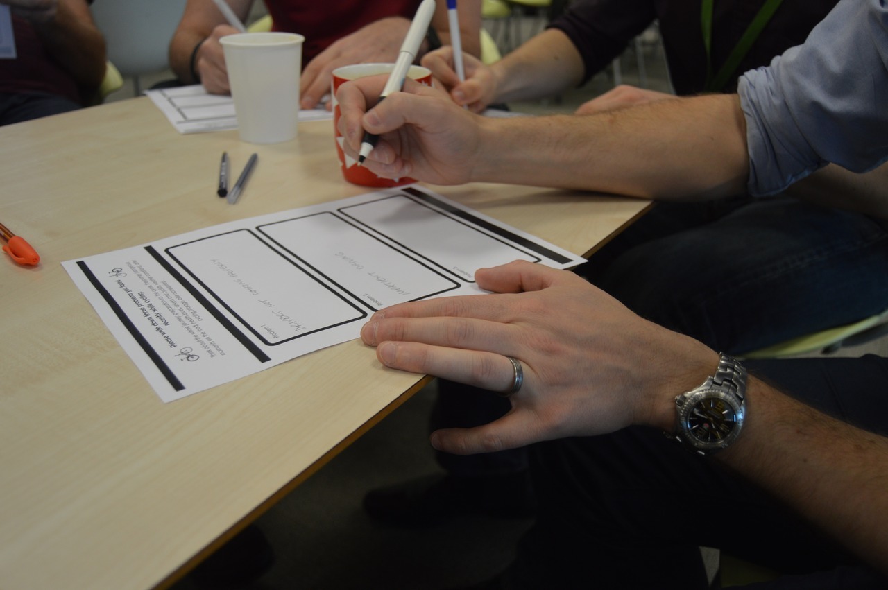
I run a focus group with the cyclists from NCR to find out more about everyday struggles of a cyclist - commuter. In the beginning of the session I asked the participants to write down three cycling issues each. I was hoping this first activity would give the cyclists a chance to think about the individual issues they are facing, before engaging in a group discussion.
Key insights:
Cyclists were the most concerned about safety, particularly while cycling through the city. They mentioned the feeling of being very exposed in comparison to the motorists who are surrounded by ‘metal casing’. Cars do not expect cyclists could be rather fast on the road and often try to overtake cyclists, not realising how dangerous it could be for the other road user. Busy cities were agreed to be the most dangerous. “There is too much distraction in the city and people are in a rush” Cyclists are worried about safety on the roads and stated they would not encourage their own kids to cycle.
They stated that many schools feel the same and refuse to teach the children. Issues regarding the cycle paths:
- they are often too narrow, or filled with dangerous debris
- a lot of the cycle paths is not gritted in the winter. Cyclists stated that they were forced to change the routes in the search for safer, less slippery paths
- they often disappear and are not well marked
- they are often shared with the pedestrians, and it is difficult to find a way of warning them about approaching and staying polite
- cars often park on cycle paths What performance tracking accessories do the cyclists use? – computer: for speed, guidance, distance, maps, heart rate, tells you the current temperature, bad weather warning
What encourages people to cycle?
- health benefits: cyclists reported that they feel fitter and happier “I cycle so I can eat more, drink more, have fun and live longer.” “Sets you up for the day, it is a way of bumping up the energy.”
- Strava: uploading all of the data, it encourages you to improve your performance each day
- low cost
- a way of avoiding traffic
- shared passion with other cyclists “So many people will buy a bike and never use it again. I would use it just because other people were doing it. It is really about the confidence, and knowing how to use your bike.”
Testing different ways of reporting dangerous roads
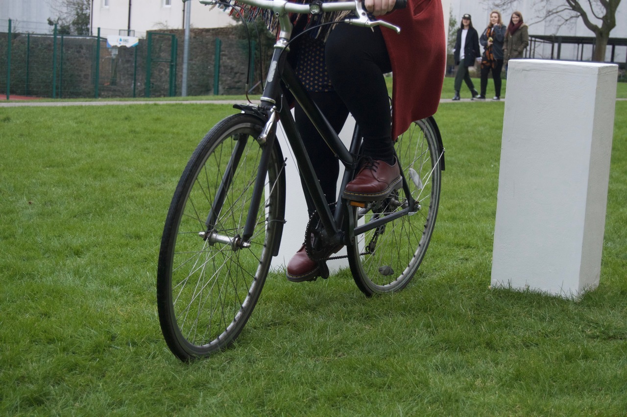
I run a short study in order to test if cyclists would prefer to use both a device and an application to report dangerous areas, or just one of them. I searched for the most effective way of reporting, that would be both convenient and quick. When are cyclists most likely to report the dangerous situation? I asked five different cyclists to cycle through a relatively narrow space(the closest we could get to a ‘stressful’ situation without putting anyone at risk) and then asked them to cycle around, go through the narrow space and then cycle a little bit more. I left it to their interpretation when they will decide to press the button/use the app/do both to report the ‘dangerous’ route.
The outcome – key insights:
- Cyclists preferred to use the button to report the location and then use the app later to add more information. The button was used, because the cyclists preferred to keep on moving, instead of stopping to use the app, which could be too dangerous. Two of the cyclists specified that they would be more likely to fill in the data straight away if they were very angry and had a safe place to stop nearby.
- Most of the cyclists pressed the button straight after encountering the stressful situation. The small percentage remaining pressed the button just before approaching the narrow narrow pass.
- The cyclists stated that they would prefer to fill in the remaining data later. A notification system or adding data such as speed/distance/social network/amount of accidents to encourage the user to complete the report were suggested.
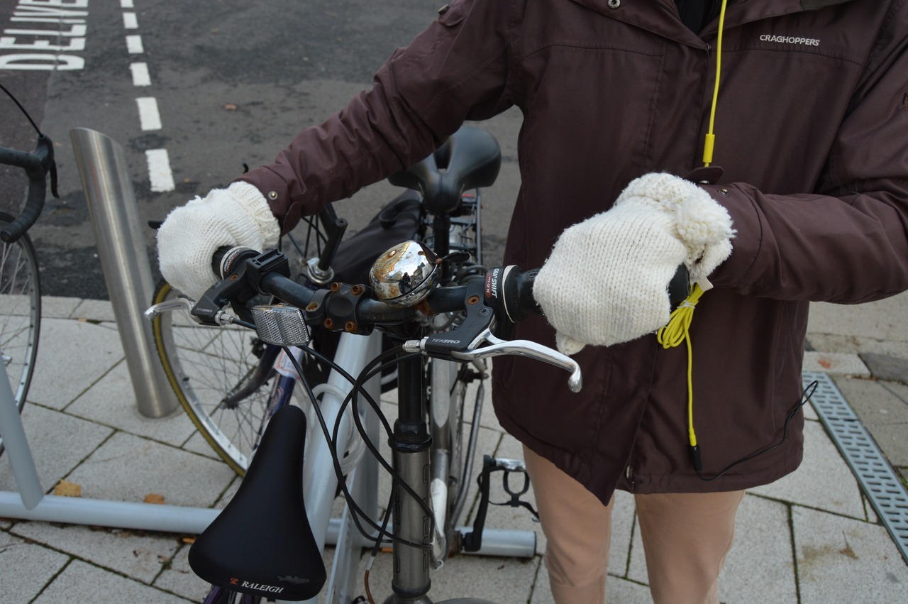
- The placement of the button close to the handlebars was regarded as the most comfortable.
Brand design
Who are the users: cyclists commuters, cycling community. According to the CTC statistics men cycle more than women (28 to 9 on average). The age group that cycles the most is from 21 to 49 years old.
Keywords associated with the brand: community, convenience, tool for change, reliability, smarter route planning
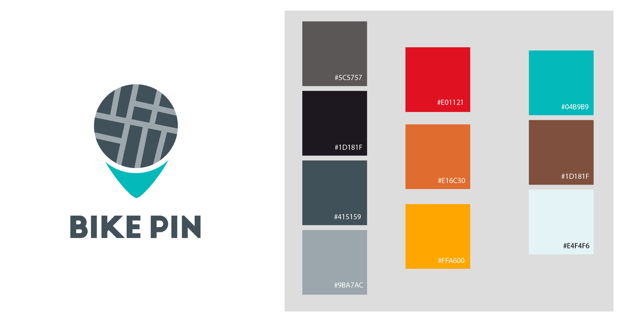
After a brainstorming session and name generation with other students, I decided to combine two key elements: bike and location pin into the name: Bike Pin.
This simple name indicates connection to cycling and the key focus of this project: location based data, helping users select a safer route. The final logo design focuses on the location - combining a simplified map grid and a location pin.
Wireframes and User Testing
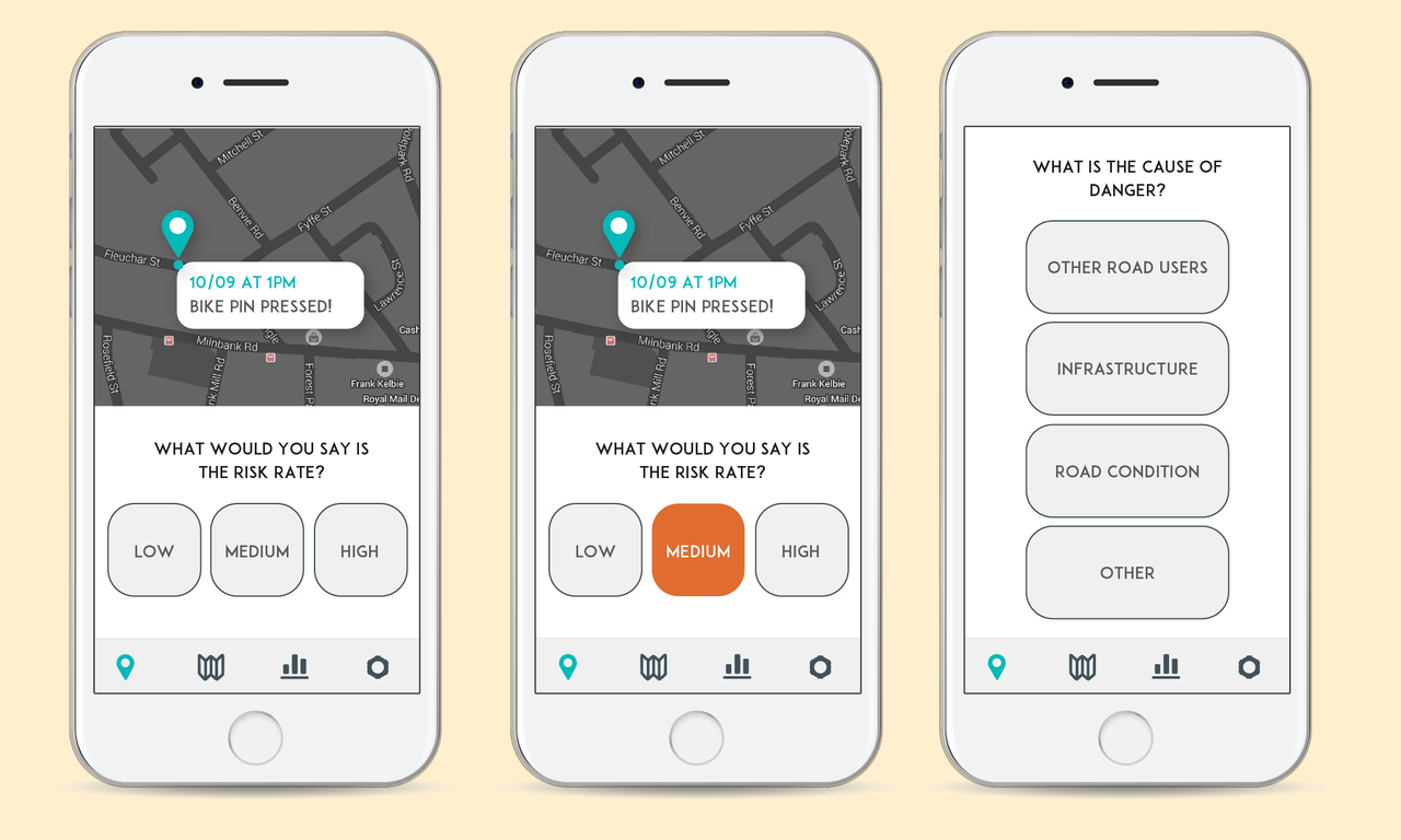
Quick reporting of dangerous area is the key Bike Pin feature. I prototyped different ways that could be used for data input, aiming to provide a time efficient and intuitive system. Once the Bike Pin device is pressed, the time and location will be submitted to the smartphone application. The details that user will update later will include the danger rate to achieve the heat map effect of the submitted data.
Information will also include the three most common reasons for accidents/dangerous situations to occur:
- other road users involved, an indication of busy roads/dangerously designed roads
- infrastructure issue, for future infrastructure planning and avoiding of the dangerous areas
- road condition, a warning for other cyclists
The user will also submit a short description, for the cyclists who would like to find out more detail about the particular issue. To find an intuitive and efficient way of data input, I prepared three options of both risk assessment and cause of danger specification and tested them with the users.
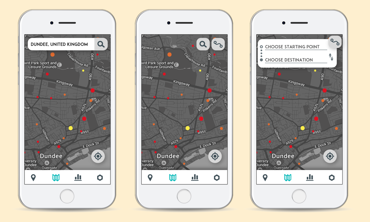
Map prototyping
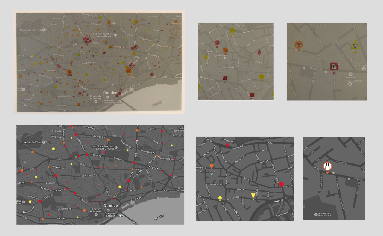
I am planning to use a grayscale map for my application design, in order to make the submitted data stand out more. The maps used in the initial screen states designs were too light to effectively contrast the reported pins. I decided represent the data on a much darker map: For the application design I would like to show three main states of the map:
- Zoomed out completely (example: viewing whole of Dundee) The risk levels and the place where the Bike Pin was pressed to report the problematic area are represented as dots on the map. The larger the dot, the more cyclists voted on the issue, in order to indicate the importance.
- Zoomed in (example: an area of Dundee) Once the user zooms in, the three shapes representing the three main categories become visible.
- Zoomed in further (example: viewing particular street in Dundee) The final stage of zooming in to see the data. The user now can see an icon representing the particular issue. If he/she would like to find out more, the icon can be clicked and the key information with an option to ‘vote’ on the issue is shown. I used tracing paper and print outs of the maps to prototype the data visualisation further. I would like to keep the data visualisation relatively simple. The reporting pins submitted will have a form of simple geometric shapes. Choosing a darker colour scheme made a big difference for the data visualisation.
Device
Prototypes
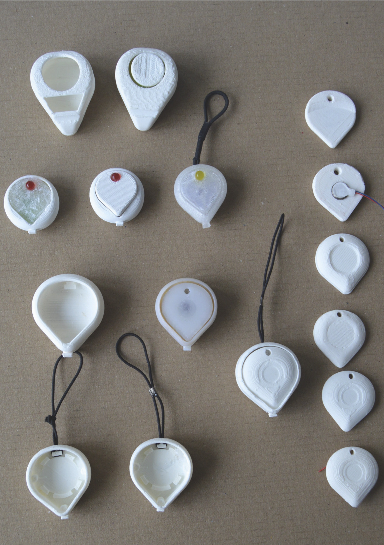
Before prototyping the initial ideas for the reporting button, I looked into different elements that will have impact on the design. Depending on the bike type the diameters of the handlebars vary from 22.2mm to 31.8mm. The button has to be easy to attach and fit on a variety of handlebar sizes. Most of the bike accessories consist of two part attachment, which includes a holder fixed onto a bike and the accessory that can be clipped in and out of the holder. The type of fixture I was planning to use had to be light and convenient. I decided to reduce the fixture to a simple piece of a flexible cord. I experimented with different possible shapes that the button could have and made clay prototypes. They can be categorised into three main concepts.
- Following the shape of the handlebars. The button could be pressed or twisted to send the GPS location and time to the app. This button design could be pressed in from the side – creating different interaction(this design was tested and is too uncomfortable so will not be explored further).
- Inspired by the simple geometric shapes of road signs. The shapes are slightly curved from the back to fit the handlebars. Simplified form of the button.
- Inspired by the ‘location pin’. This shape would suggest the main purpose of the button, which is the reporting of GPS location. This shape would leave enough space for attachment of the rubber cord and an indent to guide the cord. It is a promising concept that suggests the main feature, without the use of an over complicated form. It also fits with the overall branding.
Button shape and feedback
Bike Pin device’s main feature is the button that the user presses to report a dangerous location and warn other cyclists. I was looking for an appropriate type of feedback that would effectively communicate to the cyclist that the GPS location was reported. First prototypes feature an LED light, which lights up after the button was pressed to then fades away and be ready to be pressed again. After showing my prototypes to other cyclists I realised that I should add another form of feedback, which would not require for cyclists to look directly at the product. The developed prototypes will feature an orange LED (orange is a colour of alert, which will brighten up as a confirmation of the button being pressed) and a vibration motor. Even if cyclist using Bike Pin will not be able to look at the product, they will feel the vibrations as soon as the button was pressed. I looked into different shapes that the button could have. Firstly, I started with a flat surface, but after testing it I realised it was not comfortable for the finger to rest on. Next I tried to add a rounded ridge at the top of the button, hoping that it will help to guide the finger to the middle of the surface. After printing it in 3D and testing it I realised that this solution was still uncomfortable, as the main surface that was in contact with the finger was flat. In the next prototypes I decided to make a rounded indent in the middle of the button. This approach proved to be the most successful, as it was guiding the finger straight to the middle of the button, where it could rest comfortably and securely for the moment of pressing. This type of shape is popular within the ‘traditional’ push buttons and it proved to work well with this particular example.
3d printing
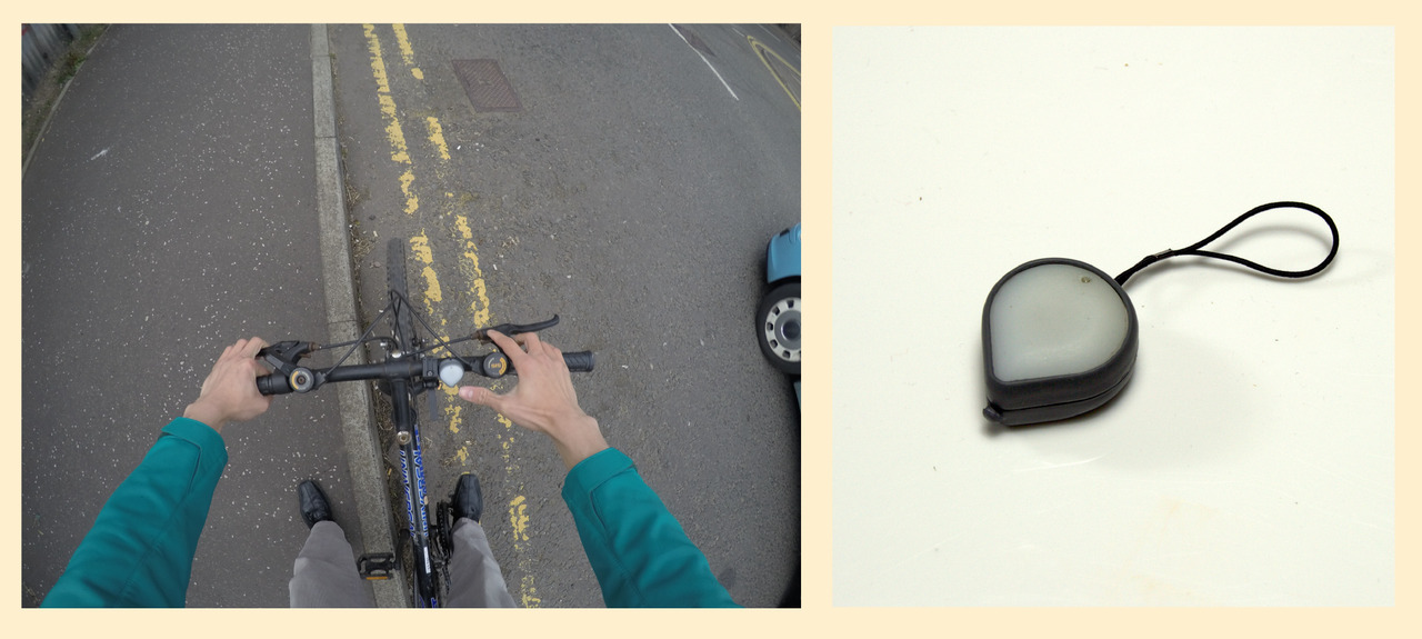
I 3D printed the final prototype. I used ABS for the main enclosure, as the prototypes I printed before were aligning without any issues. The surface was sanded down and sprayed painted grey, in order to match the colour scheme of the application.
Bike Pin device
Location based data is one of the most important, however it often takes a lot of time to submit and requires a lot of commitment from the user. Bike Pin product communicates the exact location of the cause of danger, which is as easy as pressing a button. Shape of the device resembles a location pin and indicates the purpose of the product. Bike Pin gives two different types of feedback for the user in order to notify the GPS data was submitted: LED light and a small vibration as user presses the button. The push-button cover features an indent in the middle, for a more comfortable finger placement. The top of the button was printed in resin, which gave it a smooth surface.
Final design
Bike Pin app
Concept video
The first screen user sees after opening the Bike Pin application is the map of the area he or she is currently in and can explore the data. Displaying the location on the map enables the user to quickly view the area and plan a safer route. Start screen also contains the main navigation menu. Each Bike Pin that was submitted visible on the map, can be tapped by the user in order find out more details. The user can also ‘support’ the reported pin to highlight the most important issues.
The process of updating the details is quick and efficient. User goes through an easy selection process, specifying risk level and cause of danger. The causes of danger were narrowed down to three main categories. There is an additional option of “other” in case the reported danger does not fit into a specific category. The user is able to review all of the submitted Bike Pins and to adjust the data at any time. This generates dynamic maps, constantly updated by the users.
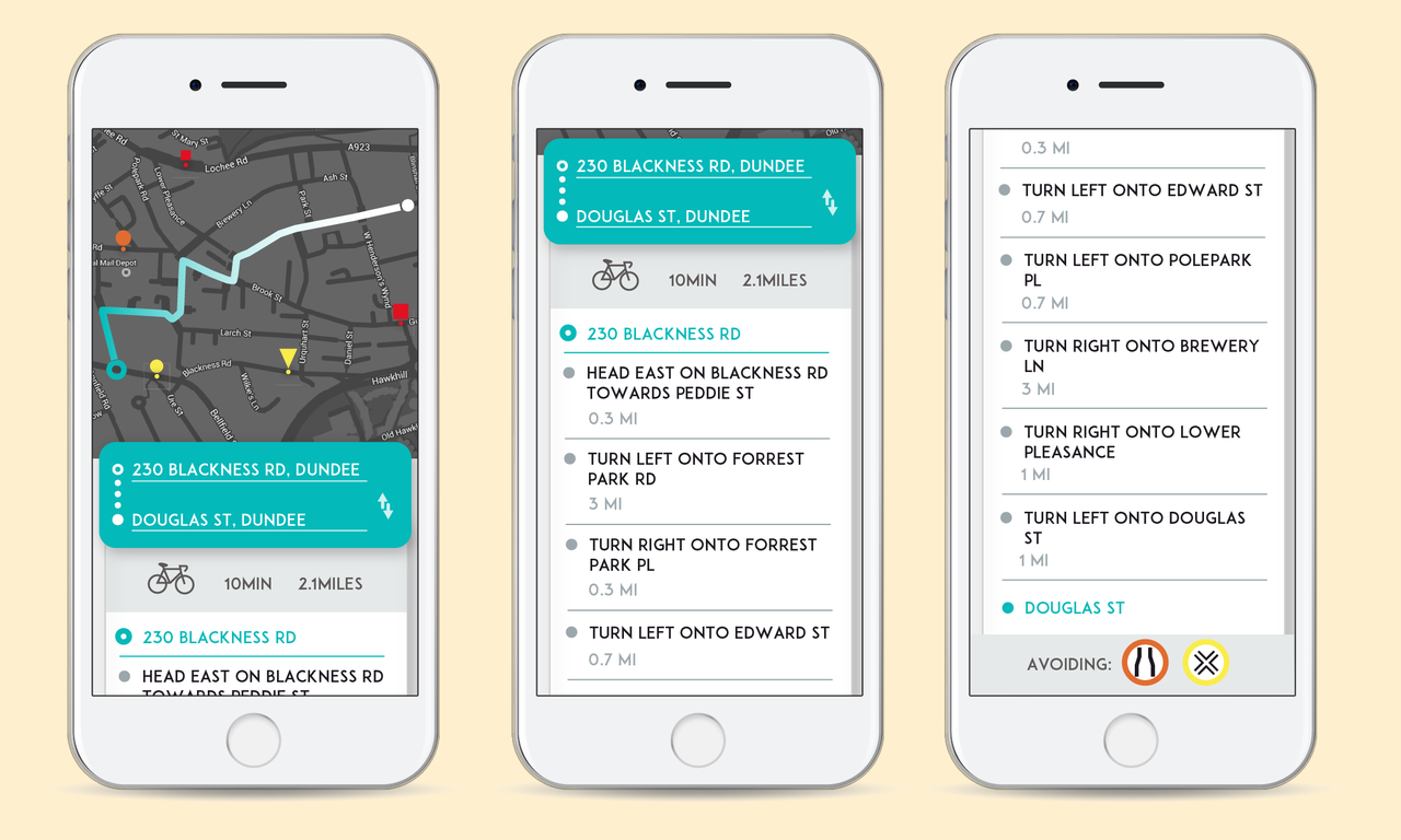
The route planning feature advises the user a safer route choice by recommending a journey avoiding the most dangerous areas. The hazardous areas are listed underneath each route plan. Standard information, such as time and distance, are also displayed. The route plan is displayed on a map featuring the dangerous reported areas.