Improving Costco's online membership experience
Strategy
UX
UI
OVERVIEW
While I was working at a design agency, Costco reached out to us to improve their online membership experience. This project focused on improving the process of signing up, renewing and upgrading online. I worked on removing friction from these critical user flows, and focused on providing specific prompts based on spending and user needs.
Reviewing Help Center Articles
I started this project with reviewing the most popular help center articles. Users needed help with changing their membership level, renewing, or understanding the different types of membership available.
Stakeholder interviews
I interviewed the key stakeholders at Costco to dive deeper into key objectives, opportunities, risks and success metrics for this project. I found out that the current online experience was not as refined as the in-person experience of singing up. We identified the need to promote and educate throughout the user journey. Users did not know the additional perks of upgrading, or what was included in different levels of membership. A majority of users did not convert to sign up and would be likely to abandon the Membership Landing Page.
In-store customer interviews and key findings
I went to my local Costco to interview customers and find out more about what motivated them to sign up, upgrade and renew. I wanted to determine to what extent members are aware of the benefits and services available to them with their membership.
Proximity: distance to the store was often mentioned as one of the key factors considered when selecting a store
Quality: customers expect and value high quality products at Costco
Trust: Customers trust Costco in providing the best quality at the lowest price
Convenience: buying in bulk was often mentioned as convenient, in particular by customers who have kids
Price: savings were often mentioned as important, customers were hoping to make smart choices and manage their money well
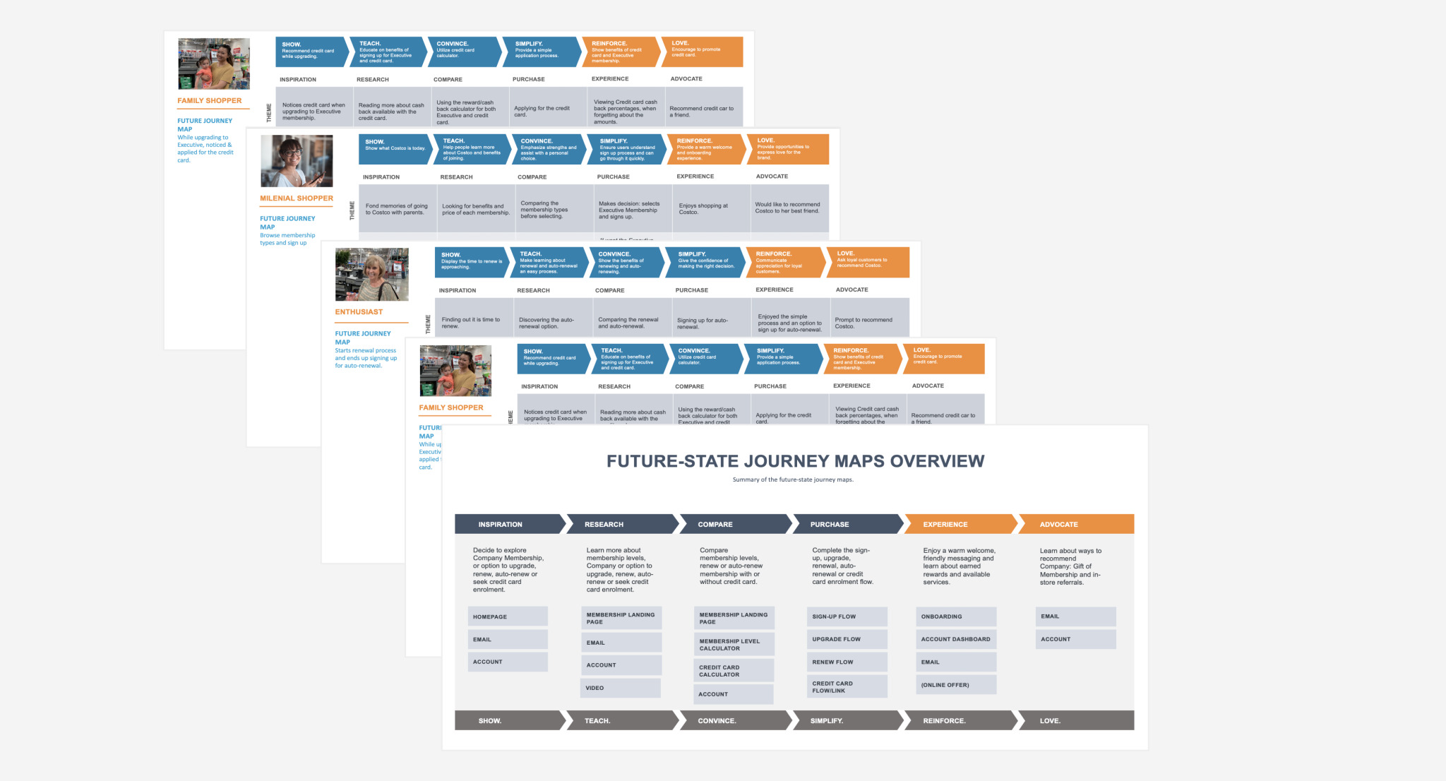
Inspired by the in-store experience, I worked on future state user journeys.
Interviewing non-members
I also interviewed non-members to understand what could be a potential reason for not getting a membership. Participants were often concerned about the amount of storage they have (Costco sells items in bulk), they lived far from the store or were not aware of the benefits of joining.
Interviewing staff members
To make sure I learn from the in store experience, I interviewed staff members about their process. Each staff member had a pitch that they would use to highlight key benefits of becoming a member, renewing or upgrading. They were well prepared to answer any questions and deal with objections. Renewing or upgrading was suggested at the right time, based on user spending and if their membership was about to expire.
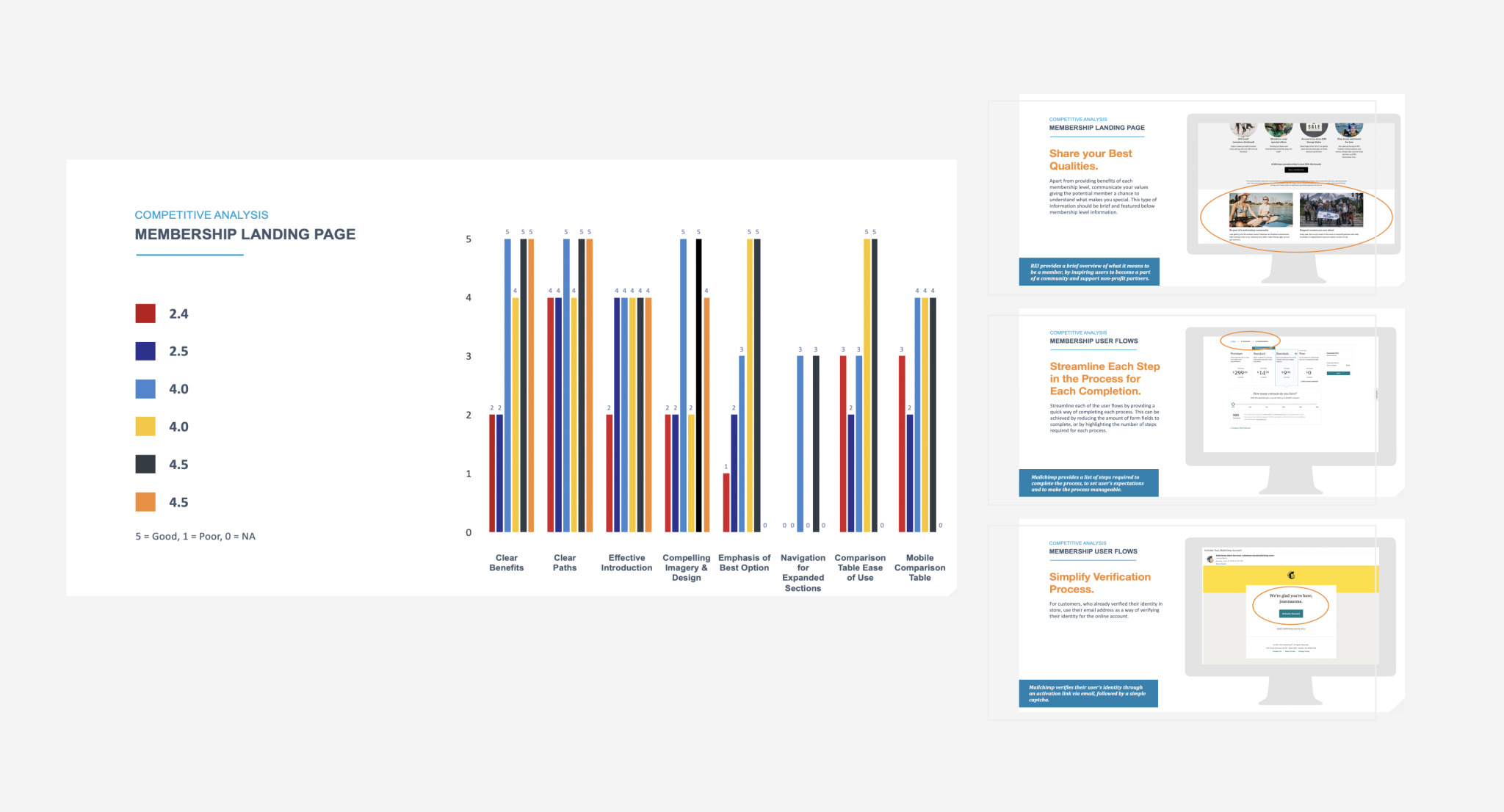
Competitive Analysis
I reviewed other membership experiences from the initial step of an overview of why someone should sign up, through sign up journey and onboarding. The main takeaway was to make it easy to understand reasons to sign up. Once the customer makes the decision to proceed - make the process as frictionless as possible.
KEY IMPROVEMENTS
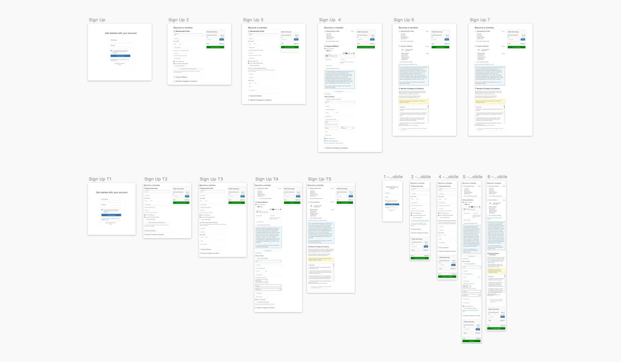
Simplified user flows
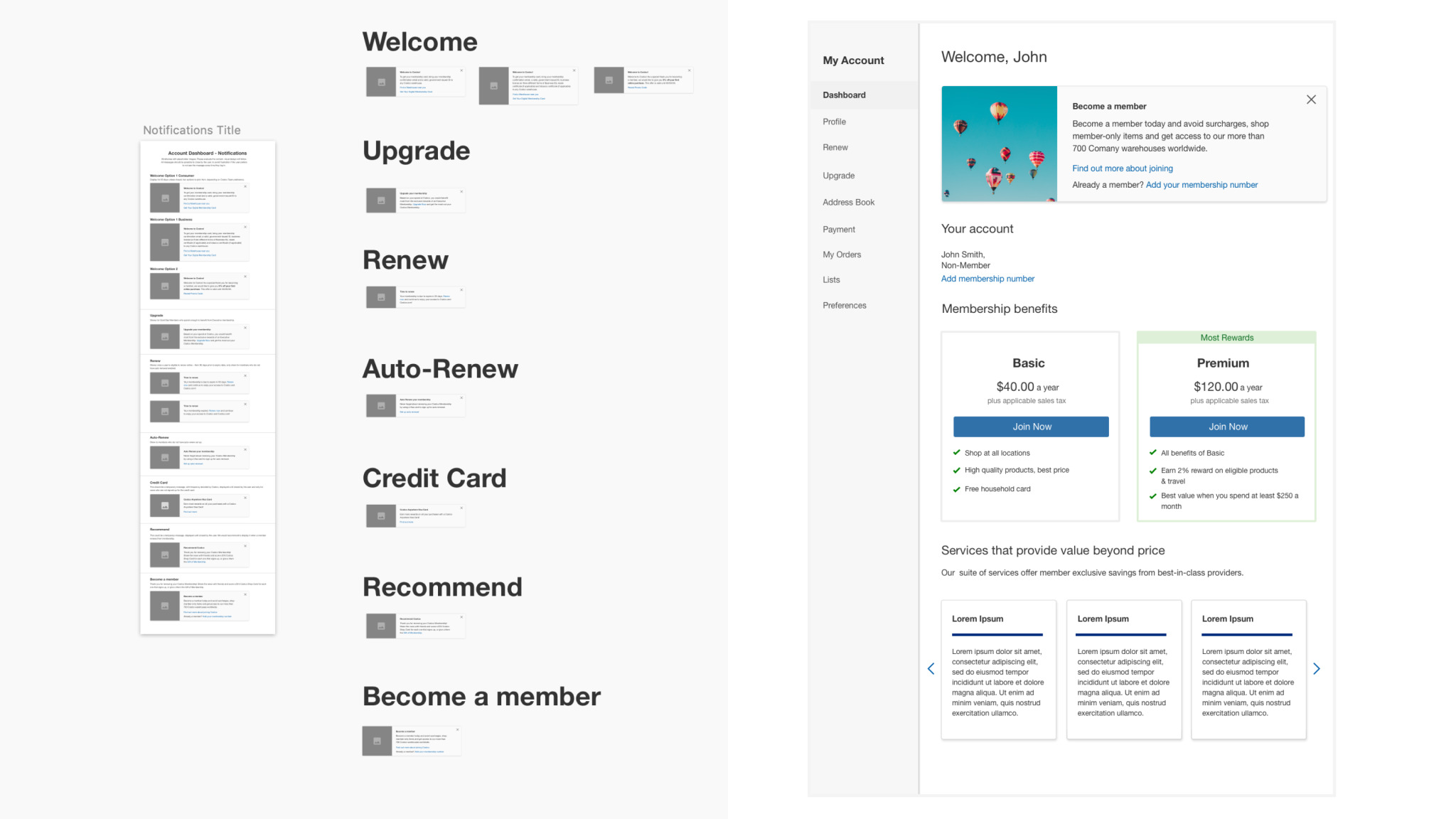
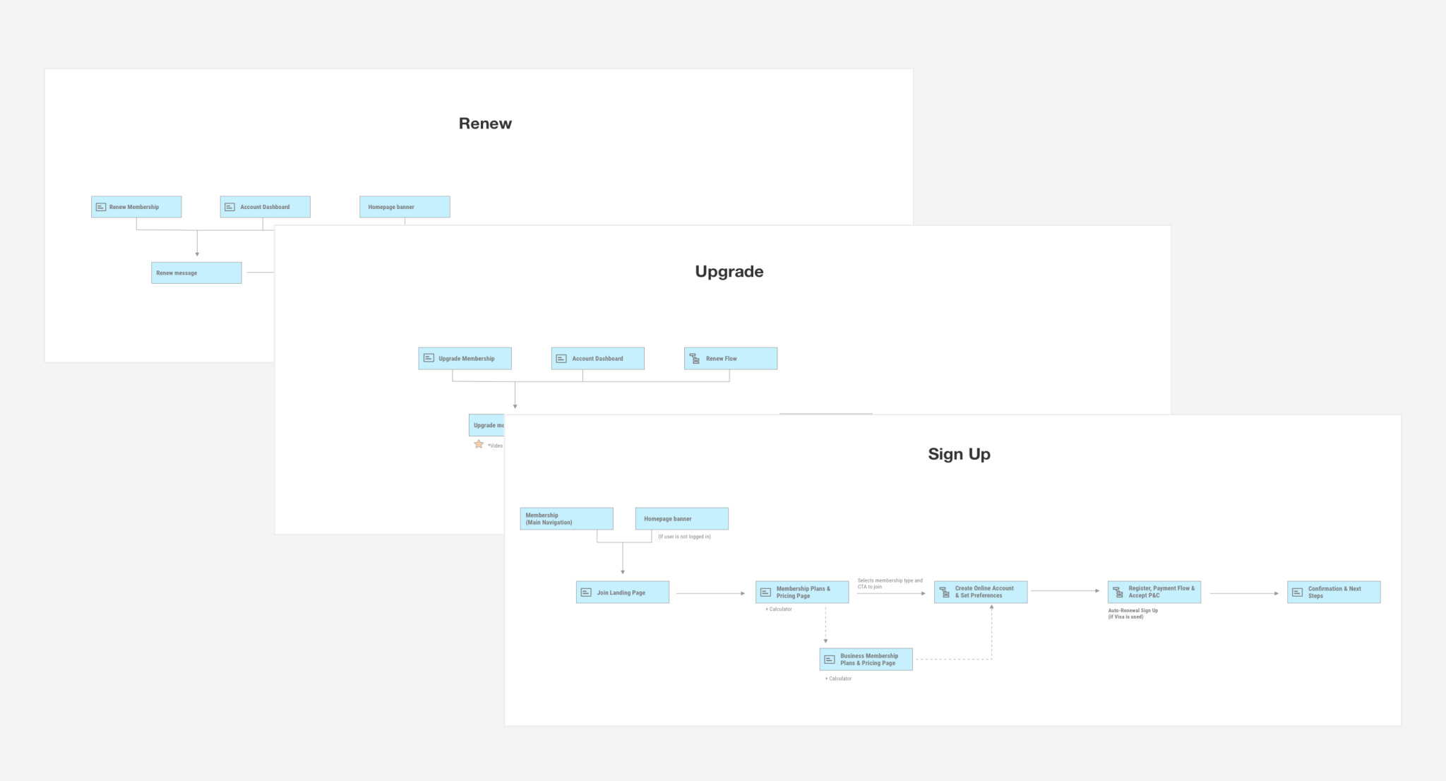
I mapped out the ideal user journey for sign up, renewal and upgrading online. I simplified the user flows and worked with the Costco design team to make sure I design using the latest Costco components. Removing the friction and making it easy to complete each flow was critical to this project. As part of the Account redesign, I made sure “Renew” and “Upgrade” were one of the navigation items - to make them as easy to find as possible.
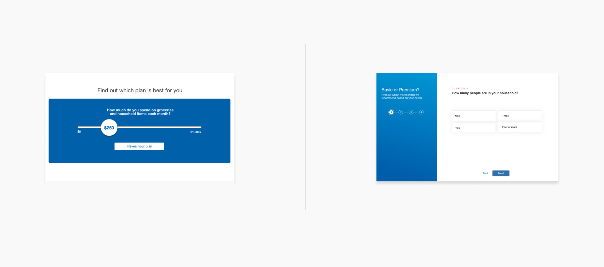
Personalized choice
We set out to repeat the in-store experience online. Staff members ask a series of questions before making a recommendation, making it easier to select the right type of membership for your household. I tested two versions of the “membership calculator” with users. The first version was simply just based on the amount someone is planning to spend, and the second version was a step by step wizard. The simple version was quick and effective, our users preferred to get to the recommendation as quickly as possible and then proceed to sign up.
Provide recommendations at the right time
I wanted to replicate the in-store experience and only suggest upgrades or renewal if it was relevant to the user. I designed a series of notifications to show on the Account dashboard to prompt the user to take action. The notifications would also be based on their spending and would highlight if the user could take advantage of other services available.