Designing a performance dashboard for small business owners
Strategy
UX
UI
2 Front End Developers
2 Backend Developers
1 Product Owner
1 Product Strategy Manager
OVERVIEW
Crunch provides online accounting software for small businesses in the United Kingdom. As a Product Designer at Crunch I worked on a variety of projects: from new features to a range of usability improvements to Crunch software. This new performance dashboard was one of my favourite projects.
Help small businesses easily track their performance
Performance graphs and access to useful infographics were one of the most popular feature requests. The goal of this project was to help our customers, small business owners, easily track their financials and plan for business growth and stability.
I started with reviewing the existing graphs, which were displayed across different dashboards. The most frequently reported issue, was that the existing graphs refreshed their data every year. I made sure the new designs will give our users access to all of their data, a simple improvement that will make a big difference. It was difficult for our users to have an overview of their company’s performance at a glance. I collaborated with the Product Owner, to send out an initial survey and find out more about the types of content that our users would like to see on their dashboard.
“It would be nice to see some statistics like money made this year, profits over all, mainly related to income and expenses. Since I'm a one person company, I don't have much else I'd like to see other than these, but it'd be nice to see yearly statistics so I can switch between and check progress.”
Other dashboard examples
I compared graphs and dashboards displayed by Freshbooks, FreeAgent, QuickBooks and Xero. They showed between 3 to 4 graphs on their dashboards, not overwhelming their users with too much information. The subjects revolved around profit and loss, which aligned with the content requested by our users. I also looked at unrelated companies, which provided insight into designing performance dashboards. I focused on Mixpanel, Garmin Connect and Fitbit. They showed a wide range of data, providing multiple ways of comparing and customizing the displayed information.
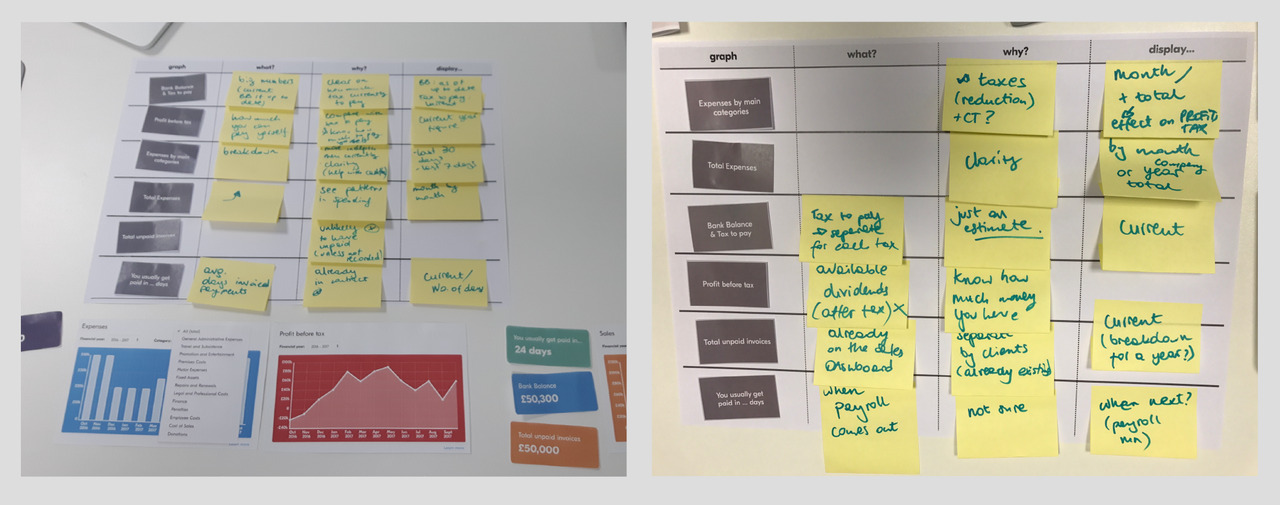
In-house workshop
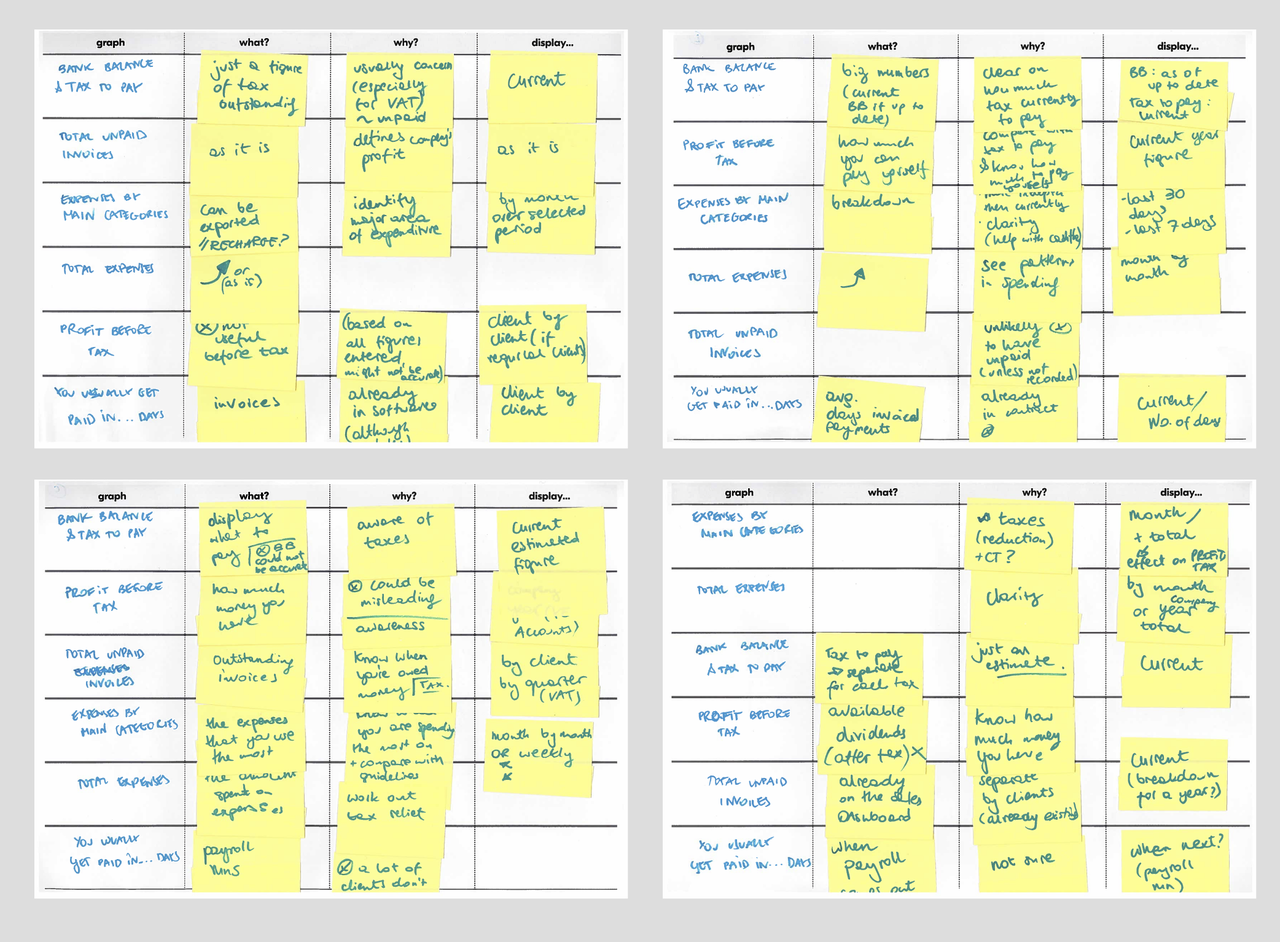
In house team of client managers and accountants understood what information would be useful to show, to help our users with performance tracking and preparing for taxes. I run a series of individual workshops with 5 different team members, to brainstorm different ideas for the type of information that would be the most useful for our users.
Technical limitations
Once I had more ideas on the type of data we should display on our dashboard, I investigated more into potential technical limitations. I found out that we could display up to three graphs with relatively short loading time. Our developers raised concerns about the graphs potentially having a negative impact on the rest of the software. We planned to carefully release the dashboard, to a small sample of users first. It allowed us to test the dashboard and fix any technical issues first, before releasing it to the rest of our users. I also saw this as an opportunity to gather feedback, and work on further improvements.
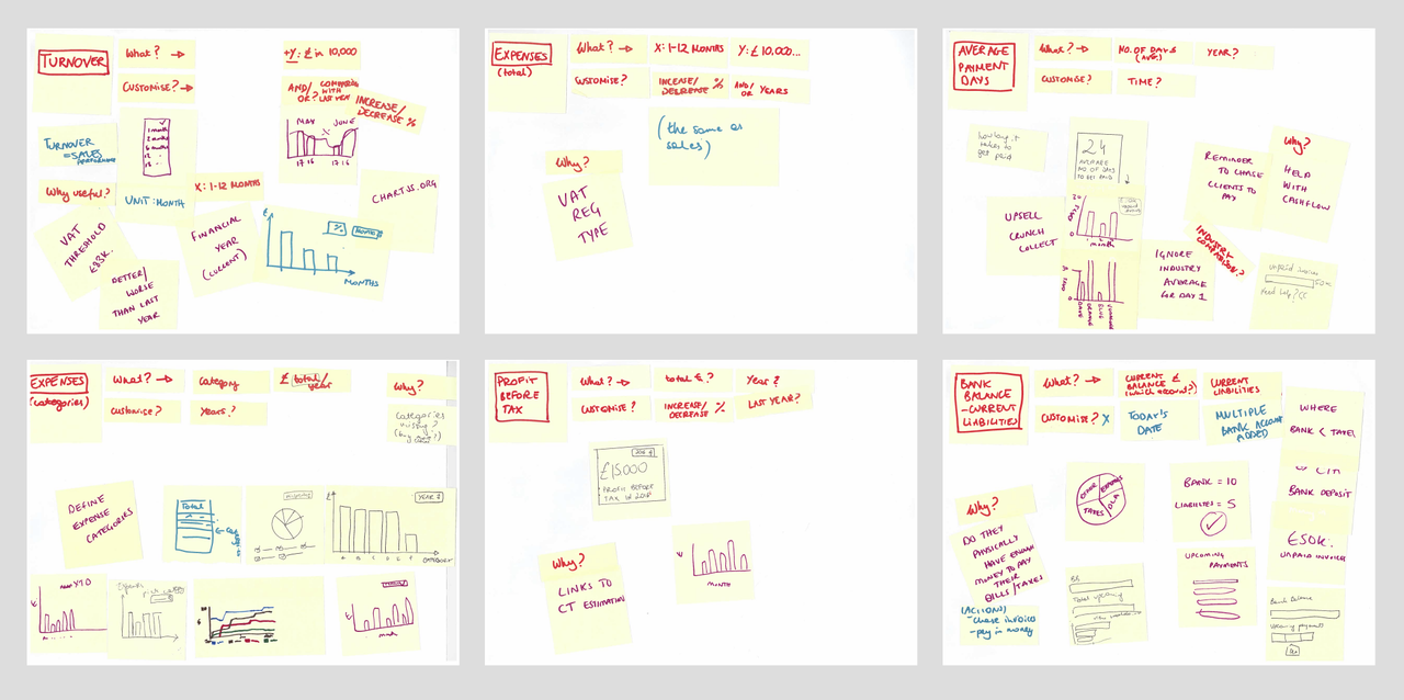
Wireframing
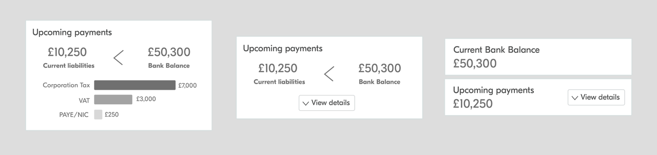
At first, I worked in black and white, experimenting with different way we could display the information within our graphs. Expenses were particularly interesting to play with, as the users could see if they are spending and reporting all eligible categories that will help reduce their tax at the end of the year. I experimented with different colors and layouts. Graphs need to be aesthetic and easy to read. Color and layout can have a big impact on the way people explore graphs.
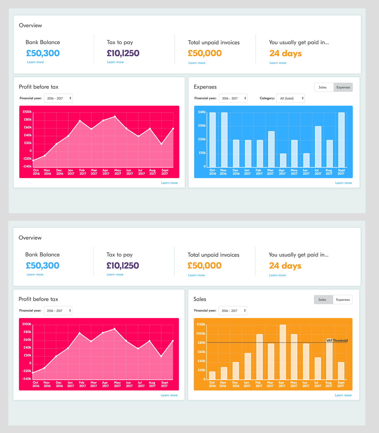
Turnover(/Sales), Expenses (total), Profit before tax
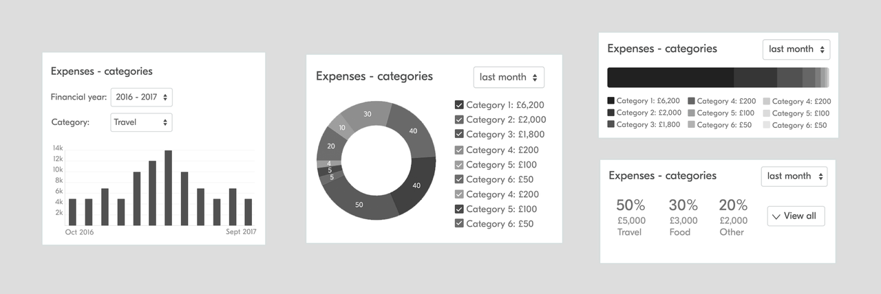
Expenses (categories)
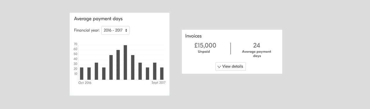
Average Payment Days
Upcoming payments/Bank Balance
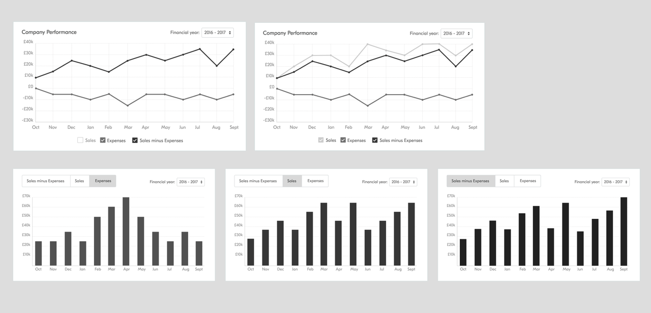
Initial Designs
Based on the gathered feedback, I narrowed down the amount of graphs displayed. Initially, I chose a bright color scheme for the prototypes.
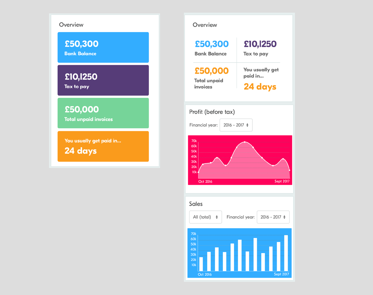
Desktop mockups:
Mobile mockups:
Review of initial graph ideas with users
I printed out the titles of my 6 graph ideas on small cards. As the first task, I was interested to see if the titles of the graphs are self-explanatory and I asked participants to describe what they are and why they would be useful. Then we prioritized them from the most useful to least, to gain an understanding of which graphs are the most attractive.
I learned that tax estimates should include a description explaining what affects the numbers. This will help our users save the right amount and understand what affects the tax amount. I also discovered that users were using slightly different wording, for example calling financial year, a company year. Expenses by categories and total expenses amount were voted as the most useful, and usually seen as a one graph.
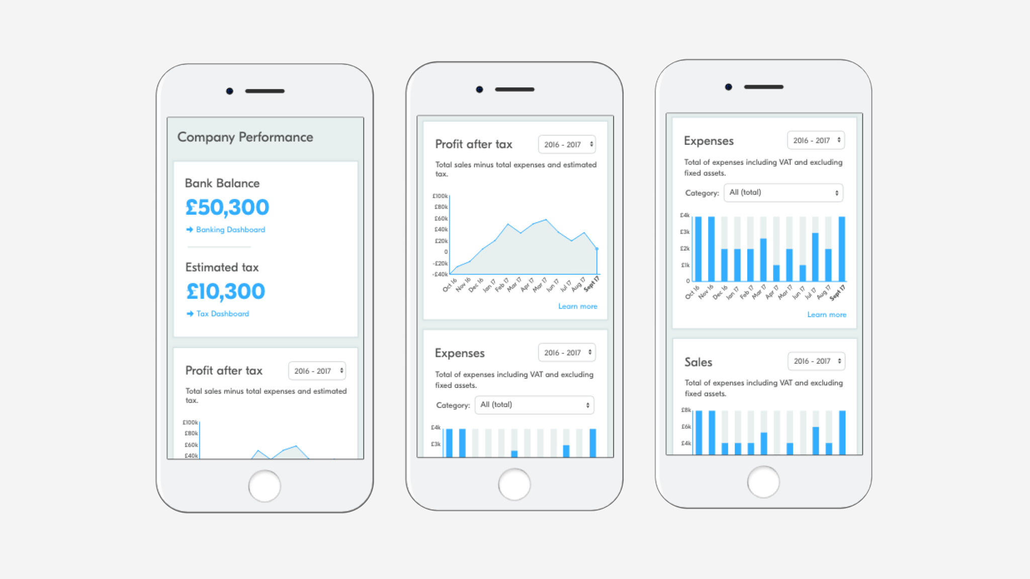
Final design and beta release
As we were unsure if the Dashboard might slow down the performance of our software, we decided to release the new page as beta. First to a small amount of our users, and then after fixing any issues, to a larger group. I included a feedback section and a survey link within the Beta release page. This made it easier for our clients to submit feedback in context. I was excited to gather additional feedback, and improve the dashboard before we release it to all of our users.
Desktop
Mobile
Results - after beta
The Performance page is now live for all of Crunch clients. The feedback we received through the Feedback Section was positive - 96% users stated the data is useful for their business. The feedback gathered also helped us plan the next range of new graphs and improvements.